
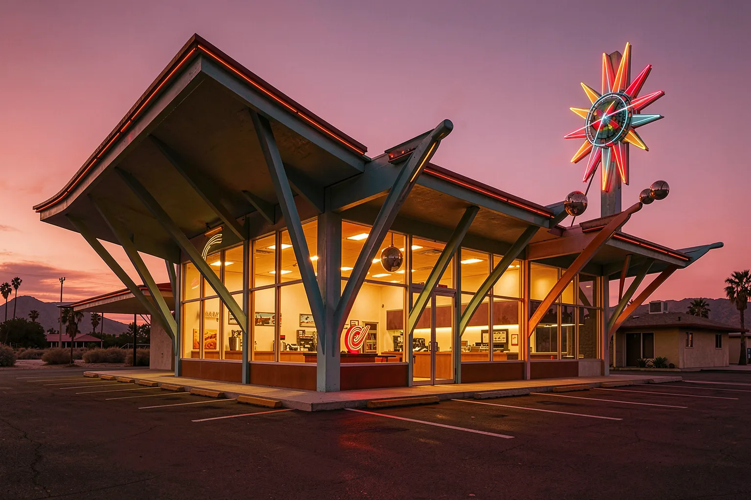
Drive down a stretch of old Route 66 at dusk and you can still catch one: a coffee shop roof that swoops up at an impossible angle, a starburst sign throwing neon against the desert sky, a wall of plate glass glowing like a fish tank. This is Googie. It was the architecture of American optimism after the war — all boomerangs, atoms and upswept cantilevers — and it is one of the trickiest styles you can ask a diffusion model to build. Most of them fail in a very specific, very funny way.
The name is almost an insult. John Lautner designed a coffee shop called Googies on the Sunset Strip in 1949, and in 1952 the critic Douglas Haskell spotted it, half-sneered, and used the name for a whole wave of roadside buildings he found vulgar. The label stuck. For decades “Googie” meant cheap, gaudy, not-real-architecture. Then people watched the wrecking balls take down the car washes and bowling alleys and realized they missed them.
What Googie actually looks like
Googie has a vocabulary, and it is weirdly precise. Roofs that fly: cantilevered, upswept, folded into sharp butterfly wings. Structure worn on the outside — exposed steel beams, often painted, often at acute angles that no load-bearing logic requires. Space-age motifs everywhere: starbursts, Sputnik orbs, atomic diagrams, amoeba and boomerang curves lifted straight from 1950s wallpaper. Huge sheets of plate glass so the whole building reads as transparent. And neon, miles of it, because half of Googie’s job was to be seen at 40 miles an hour through a windshield.
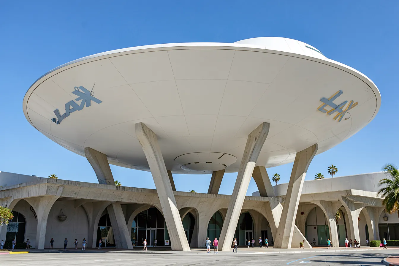
The firm that defined it was Armét and Davis in Los Angeles. They built Pann’s, Norms, the coffee shops that became the template. The Theme Building at LAX, finished in 1961, is the cathedral version — a flying-saucer disc held up on four parabolic legs. The “Welcome to Fabulous Las Vegas” sign Betty Willis drew in 1959 is pure Googie graphic design. Even the original McDonald’s golden arches started here, as a structural gimmick to catch your eye from the road.
Why the machine gets it wrong
Ask a base model for “Googie architecture” and you will usually get one of three wrong answers. Sometimes it hands you a generic 1950s diner — chrome, checkerboard floor, a jukebox — which is the interior cliché, not the building. Sometimes it drifts into vaporwave, all purple grids and palm silhouettes, because that aesthetic borrowed Googie shapes and the model can’t tell the parent from the child. And sometimes it just gives you The Jetsons: a cartoon of the future rather than a real structure that stood on a real corner in Anaheim.
The reason is supply. Googie was commercial, vernacular, and treated as disposable. A huge share of it got demolished before anyone photographed it well, and what survives online is often a blurry postcard or a nostalgia blog. The model simply hasn’t seen enough clean examples to build a strong mental cluster, so it reaches for whatever looks adjacent. The style’s own influence works against it — because so much later pop culture copied Googie, the copies outnumber the originals in the training data.
How to actually get it right
Specificity rescues it, same as with any thin style. Don’t say “retro” or “futuristic.” Name the parts. “Upswept cantilevered roof, folded butterfly form.” “Exposed steel beams at acute angles, painted.” “Starburst sign, neon tubing, plate-glass walls.” Drop in a real anchor — “in the style of the LAX Theme Building” or “Armét and Davis coffee shop” — and the output snaps toward the right place far harder than the word Googie ever will on its own.
Then set the scene the way these buildings were meant to be seen. Googie was roadside, so give it a road: “corner lot, empty parking, California dusk, long shadows.” Push the light toward evening, because neon is half the point and it dies in flat noon sun. If you want the sign to read, say so — models are bad at legible text, so keep signage abstract, a glowing shape rather than real letters, unless you’re willing to fix it by hand afterward. A sketch-to-image control tool helps a lot with the roofline; draw the swoop yourself and let the model paint steel, glass and neon onto your geometry, because left alone it will quietly flatten that daring cantilever back into a boring flat roof.

From nostalgia to real design work
The easy use is mood and memory — rebuilding the bowling alley your town tore down in 1978, or imagining the motel that Route 66 never got. That has real value for preservationists, who can now show a city council what a lost landmark looked like instead of waving a faded snapshot. A few restoration projects already use AI renders to argue for saving the real thing.
But there’s a live design case too. Googie was, underneath the kitsch, a serious experiment in how a building talks to a moving viewer. That problem hasn’t gone away — think of every drive-through, charging station and roadside shop being designed right now. An architect can ask a model for thirty Googie takes on a modern gas-station canopy and steal one genuinely good idea: a roof angle, a way of lifting the structure off the ground, a reason to make the thing joyful instead of beige. The style’s confidence is the useful part. It assumed the future would be fun.
Worth saying plainly: the forms come cheap and the feeling doesn’t. Googie meant something because it rode a wave of actual hope — Sputnik, the interstate, cars in every driveway, a country convinced tomorrow would be better. A boomerang roof rendered in four seconds carries none of that. It’s a costume unless you give it a reason to exist. The machine will hand you the shapes all day; the conviction is still your job.
Build the future they imagined
What makes Googie a good match for generative tools is exactly what made critics hate it: it was never meant to be tasteful. It was meant to be bold, strange, and a little too much. That’s the sweet spot for AI image work, where the safe prompt gives you the dull answer and the reckless one gives you something worth keeping. Point the model at a Los Angeles corner in 1961, not at a generic diner, and it will start throwing shapes you didn’t expect.
Want to raise a flying roof over your own corner lot and light it up in neon? Bring a clear reference and a bit of nerve, and try the tools at ai-art-designer.com — the excess is the whole idea.
Images: AI-Designed
Dieser Beitrag ist auch verfügbar auf:
 English